Research Highlight: GGE Biplot Analysis for Multi-Environment Trials
Research Highlight: GGE Biplot Analysis for Multi-Environment Trials
In the dynamic world of agriculture, the quest for superior crop varieties is a continuous and complex endeavor. Breeders constantly strive to develop new cultivars that not only offer high yield but also exhibit remarkable stability across diverse growing conditions. This critical challenge is often complicated by the phenomenon known as Genotype by Environment (G×E) interaction – a scenario where genotypes perform differently relative to each other across various environments. Understanding and effectively managing this interaction is paramount for making informed decisions in crop improvement programs.
Traditional statistical methods, while foundational, often fall short in providing a holistic, visually intuitive understanding of these intricate relationships. This is where advanced statistical tools like the GGE (Genotype main effect plus Genotype-by-Environment interaction) biplot technique emerge as game-changers. Pioneering researchers, including Dr. B.K. Hooda, have extensively utilized and advocated for this powerful graphical tool, revolutionizing how we visualize and interpret complex genotype-by-environment interactions in multi-environment trials.
Dr. Hooda’s significant contributions, particularly in applying GGE biplot analysis to vital crops like wheat and pearl millet in Northern India, underscore the technique’s practical utility. His research, among others, demonstrates how this methodology provides a substantial leap over traditional ANOVA, offering profound visual insights into identifying the best-performing and most stable cultivars for specific target environments. For students, research scholars, and practitioners in agricultural statistics and data science, mastering the GGE biplot is not just an academic exercise; it’s a critical skill for addressing real-world agricultural challenges.
The Enduring Challenge: Decoding Genotype by Environment Interaction
Agricultural productivity is fundamentally influenced by the interplay between a plant’s genetic makeup (genotype) and the environmental conditions in which it grows. When a genotype’s performance ranking changes significantly across different locations or seasons, we observe G×E interaction. This interaction presents a formidable hurdle for plant breeders because a cultivar that performs exceptionally well in one environment might be mediocre or even poor in another. Without adequately accounting for G×E, selection decisions can be misleading, leading to the recommendation of varieties that are not optimally suited for broad cultivation or specific regions.
For instance, a high-yielding wheat variety developed for irrigated plains might struggle in rain-fed, arid conditions, or a pearl millet cultivar tolerant to drought might not achieve its yield potential in fertile, well-watered soils. The goal, therefore, is to identify genotypes that either show broad adaptation (stable performance across many environments) or specific adaptation (high performance in particular environments). This understanding enables breeders to release varieties tailored to specific “mega-environments” – groups of environments that share similar genotype performance rankings.
Beyond Traditional ANOVA: The Imperative for Visual Insight
Historically, researchers relied heavily on statistical techniques like Analysis of Variance (ANOVA) to quantify the significance of genotype, environment, and G×E interaction effects. While ANOVA is crucial for determining if these effects are statistically significant, it primarily provides p-values and sums of squares, offering limited direct insight into the *nature* of the interaction. It tells us that G×E exists, but not *how* specific genotypes perform relative to each other across environments, or *which* environments group together in terms of genotype response.
To overcome these limitations, agricultural statisticians sought more comprehensive and intuitive tools. The need for methods that could visually represent complex multivariate data, elucidate patterns, and facilitate decision-making became apparent. This paved the way for multivariate statistical techniques, with the GGE biplot emerging as a powerful and widely adopted solution.
Introducing the GGE Biplot: A Powerful Visualization Paradigm
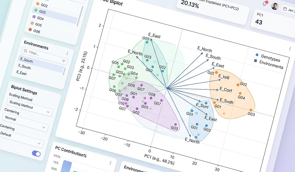
The GGE biplot is a graphical representation of the GGE model, which decomposes the genotype-by-environment two-way table (typically yield data) into principal components. The “GGE” stands for “Genotype main effect plus Genotype-by-Environment interaction.” This model explicitly acknowledges that both the main effect of genotype (G) and its interaction with the environment (GE) are relevant for genotype evaluation and mega-environment delineation. The environment main effect (E) is considered irrelevant for these specific objectives, as it only influences the overall mean of an environment, not the relative performance of genotypes within it.
The Theoretical Foundation: Principal Component Analysis (PCA) and SVD
At its core, the GGE biplot leverages principles from Principal Component Analysis (PCA) and Singular Value Decomposition (SVD). When applied to the genotype-by-environment data matrix, SVD decomposes the centered and scaled data (where environment means are removed) into a set of orthogonal principal components. These components capture the maximum possible variation in the data, allowing for a reduction in dimensionality while retaining most of the original information. The first two principal components (PC1 and PC2) are typically used to construct the 2D biplot, as they often explain a large proportion of the total GGE variation.
Each point on the biplot represents either a genotype or an environment. The position of these points, their distances from each other, and their angles relative to the biplot origin and axes provide rich insights into their performance and relationships.
Interpreting the GGE Biplot: Unlocking Key Insights
The beauty of the GGE biplot lies in its ability to simultaneously visualize multiple aspects of genotype and environment interactions. Researchers can derive several critical insights by interpreting the biplot:
1. The “Which-Won-Where” Pattern and Mega-Environments
- Polygon View: A convex hull (polygon) drawn around the genotypes on the biplot helps identify the genotypes that are vertex genotypes – those that perform best in at least one environment.
- Rays from the Origin: Perpendicular lines drawn from the biplot origin to the sides of the polygon divide the biplot into sectors. Environments falling into the same sector indicate similar genotype rankings, forming “mega-environments.” The genotype at the vertex of that sector is the “winner” or highest-yielding genotype for all environments within that sector. This is perhaps the most powerful feature for breeders aiming to develop varieties for specific regions.
2. Genotype Performance and Stability
- Average Yield (Mean Performance): A line passing through the biplot origin and perpendicular to the Average Environment Axis (AEA) represents genotypes with similar average yields. Genotypes located further along the positive direction of this axis generally have higher mean yields.
- Yield Stability: The projection of a genotype onto the AEA indicates its mean performance. The distance of a genotype from the AEA (its perpendicular deviation) reflects its stability. Genotypes closer to the AEA are more stable across environments, while those further away are more specifically adapted. An “ideal” genotype would be one with both high mean yield (far along the positive AEA) and high stability (close to the AEA).
3. Environment Characterization
- Discriminating Power: The length of the environment vectors (distance from the origin) indicates their discriminating power. Longer vectors suggest that the environment clearly differentiates among genotypes, while shorter vectors imply it’s less useful for selection.
- Representativeness: The angle between an environment’s vector and the AEA indicates its representativeness of the overall tested environments. Environments with small angles are more representative, making them good locations for selecting broadly adapted genotypes.
- Correlation Between Environments: The cosine of the angle between two environment vectors approximates the correlation between them. Small angles indicate similar genotype responses (positive correlation), large angles (around 180°) indicate opposite responses (negative correlation), and angles around 90° suggest no correlation.
Dr. B.K. Hooda’s Contribution: A Focus on Northern India
The practical application of GGE biplot analysis has been a hallmark of the research conducted by eminent statisticians like Dr. B.K. Hooda. His extensive work has centered on applying these advanced statistical tools to critical food crops in Northern India, providing invaluable insights for regional agricultural development. For those interested in his background and expertise, you can learn more About Dr. B.K. Hooda and his significant contributions to agricultural statistics.
By analyzing multi-environment yield trials for staple crops such as wheat and pearl millet, Dr. Hooda’s research has effectively demonstrated how to pinpoint genotypes that are not only high-yielding but also stable across diverse agro-climatic zones in the region. This targeted approach is crucial for recommending varieties that maximize farmer profitability and food security in a region characterized by varying soil types, rainfall patterns, and temperature fluctuations.
His work showcases how GGE biplots visually illustrate complex interactions that would be arduous to grasp from tables of numbers. This has direct implications for breeding programs by identifying specific genotypes for specific environmental conditions or for broad adaptation, significantly streamlining the variety release process.
Methodological Deep Dive: The Statistical Backbone of GGE Biplots
To fully appreciate the GGE biplot, it’s helpful to understand its underlying statistical mechanics. The initial data typically comprises yield data from ‘g’ genotypes evaluated in ‘e’ environments, often with ‘r’ replicates within each environment. The model for yield (Yij) of the ith genotype in the jth environment can be expressed as:
Yij = μ + Gi + Ej + GEij + εij
Where:
- μ is the grand mean yield.
- Gi is the main effect of the ith genotype.
- Ej is the main effect of the jth environment.
- GEij is the interaction effect of the ith genotype with the jth environment.
- εij is the random error term.
The GGE biplot focuses on the GGE part of this model, which represents Gi + GEij. The environmental mean (Ej) is removed by centering the data for each environment. The resulting centered data matrix is then subjected to Singular Value Decomposition (SVD):
Yij – μ – Ej = gi1ej1λ1 + gi2ej2λ2 + … + εij
Where:
- λk are the singular values (square roots of eigenvalues), representing the amount of variation explained by each principal component.
- gik are the scores for the ith genotype on the kth principal component.
- ejk are the scores for the jth environment on the kth principal component.
The biplot visualizes the first two principal components (PC1 and PC2), using gi1√λ1 and gi2√λ2 as the coordinates for genotypes, and ej1√λ1 and ej2√λ2 for environments. Different scaling methods (e.g., GGE=1 for genotype-focused, GGE=2 for environment-focused, or GGE=0 for symmetrical scaling) can be applied depending on the primary objective of the analysis.
Real-World Agricultural Implications: Driving Progress
The insights derived from GGE biplot analysis have profound and far-reaching implications for agricultural science and practice:
- Accelerated Breeding Programs: By quickly identifying superior genotypes and suitable mega-environments, breeders can make more efficient selection decisions, shortening the breeding cycle and bringing improved varieties to farmers faster.
- Targeted Variety Recommendations: Agricultural extension services can use GGE biplot results to provide region-specific recommendations to farmers, ensuring that they plant varieties best suited for their local conditions, thereby maximizing yields and profitability.
- Optimized Resource Allocation: Understanding environment discriminating power and representativeness helps researchers optimize future multi-environment trial designs, saving time, money, and resources by focusing trials on the most informative locations.
- Mitigating Climate Change Impacts: As climate variability increases, identifying stable and adaptable genotypes across a wider range of conditions becomes ever more crucial. GGE biplots can help pinpoint varieties resilient to changing environmental stresses.
- Enhanced Food Security: Ultimately, by facilitating the development and deployment of better-performing crops, GGE biplot analysis contributes directly to strengthening food security at local, regional, and national levels.
Practical Application and Further Support
Implementing GGE biplot analysis requires a strong understanding of both statistical principles and agricultural contexts. While software packages like R (with packages like ‘GGEBiplotGUI’), GenStat, and SAS offer robust tools for performing this analysis, interpreting the output effectively demands expertise.
For research scholars and practitioners who need assistance in applying these advanced statistical methods to their own multi-environment trial data, or in interpreting complex biplot outputs, specialized support can be invaluable. Expert guidance can help optimize experimental design, ensure appropriate statistical analysis, and translate findings into actionable recommendations. If your team is grappling with complex agricultural datasets and needs to unlock their full potential, consider exploring Consulting Services that specialize in agricultural statistics and data analysis.
Expanding the Horizon: Related Research and Future Directions
The principles underlying GGE biplot analysis extend beyond just yield data and have inspired similar visualization techniques in other fields. For instance, the use of principal components for data reduction and interpretation is a common thread across many statistical applications, such as in estimating cotton yield before harvest using a principal component approach.
Further research is continuously exploring ways to integrate GGE biplots with other advanced genomic and phenomic data, moving towards more predictive breeding models. The ongoing development of new statistical methodologies, often building on these foundational techniques, promises even more powerful insights into genotype performance under stress conditions, nutrient use efficiency, and disease resistance.
For those eager to delve deeper into the academic contributions of Dr. B.K. Hooda and other leading experts in agricultural statistics, a wealth of knowledge is available. Explore their comprehensive body of Research & Publications, which often features detailed applications of techniques like GGE Biplot Analysis and studies ranging from crop yield prediction to understanding developmental disparities in Haryana, showcasing the broad impact of statistical rigor in addressing diverse agricultural and socio-economic challenges.
Conclusion: The Enduring Power of GGE Biplots
The GGE biplot analysis stands as a testament to the power of sophisticated statistical tools in unraveling the complexities of agricultural data. By providing a clear, concise, and highly interpretable visual representation of genotype main effects and genotype-by-environment interactions, it has profoundly impacted crop breeding and variety selection.
As demonstrated by the significant research of Dr. B.K. Hooda and others, applying GGE biplots to multi-environment trials allows researchers and breeders to move beyond simply identifying significant effects to truly understanding *how* genotypes perform across diverse environments. This understanding is critical for identifying stable, high-yielding crop varieties and tailoring them to specific mega-environments, ultimately enhancing agricultural productivity and bolstering global food security. For anyone involved in agricultural statistics or data science, the GGE biplot is an indispensable tool, offering a visual roadmap to better breeding decisions and a more resilient agricultural future.
B K Hooda
Professor of Statistics & Head, Dept. of Mathematics & Statistics, CCS HAU Hisar.